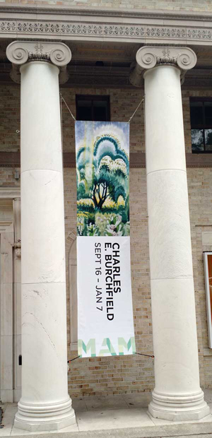
 I highly recommend the current exhibition “Charles E. Burchfield: Weather Event” at the Montclair Art Museum in Montclair, N.J. [Sept. 16 through January 7, 2018]. For me, it is always an event, and a privilege, to view up-close and in person the ecstatic, intense, mystical art of the great Burchfield (1893-1967).
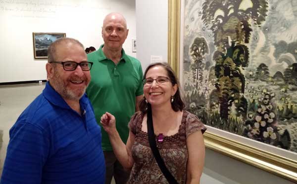
This show was a special delight, for me and Joe Kennedy, for we shared an afternoon at the exhibition with our close friends Amy Heller and Dennis Doros, founders of the film distribution and production company Milestone Film & Video. https://www.milestonefilms.com
A more intelligent, enthusiastic, fun couple with whom to view art, you couldn’t find.
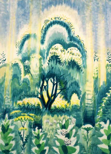
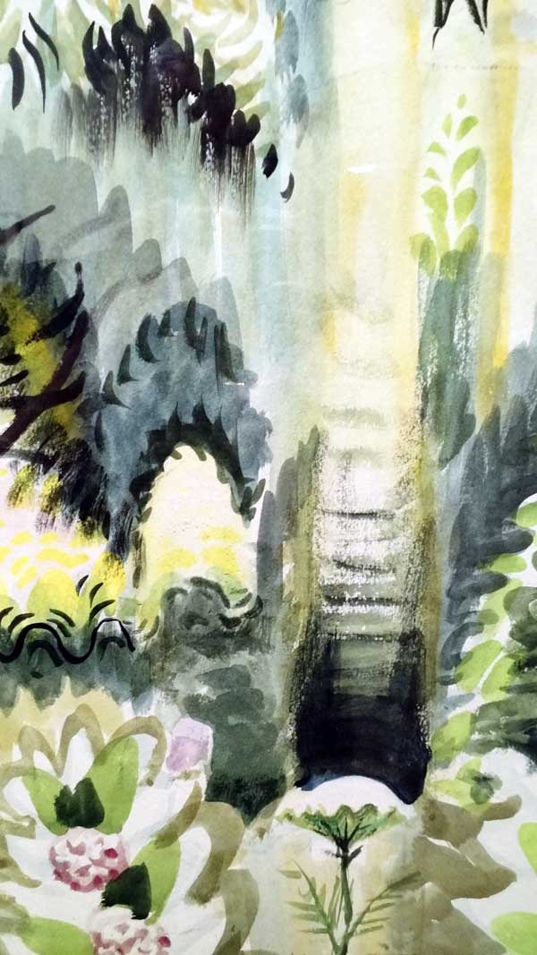
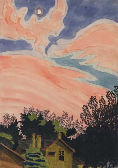
For many years, I have loved Burchfield’s awe of nature, as seen in his expressionistic landscapes painted in and around his Buffalo, New York, home.
During the Depression, he had a realist middle period; but in 1930, when the newly opened Museum of Modern Art chose Burchfield for its first one-person exhibition, curator Alfred H. Barr, Jr. focused on his artworks dating from 1917. Self-described by the artist as his breakthrough “Golden Year,” it opened his style to “a dream world of the imagination.”
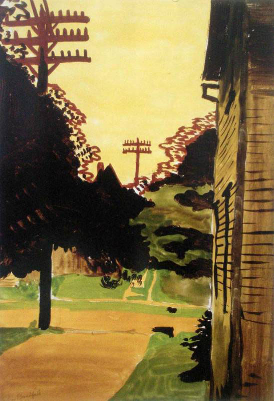
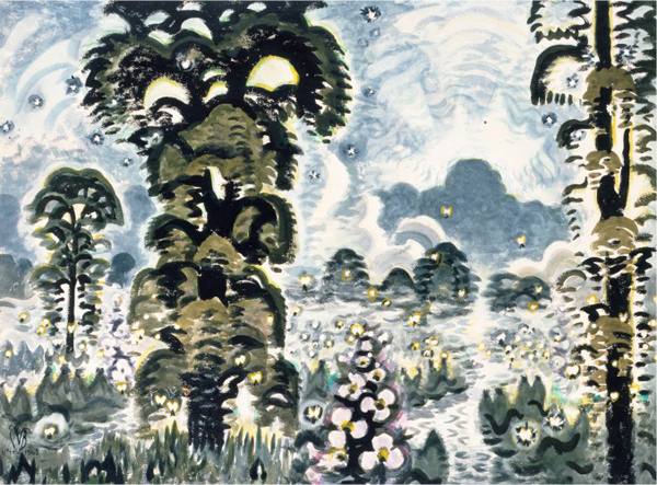
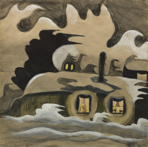
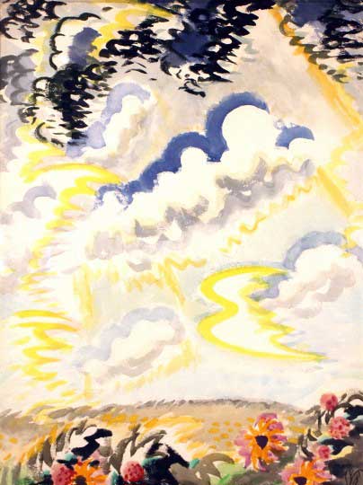
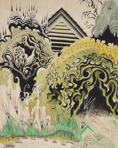
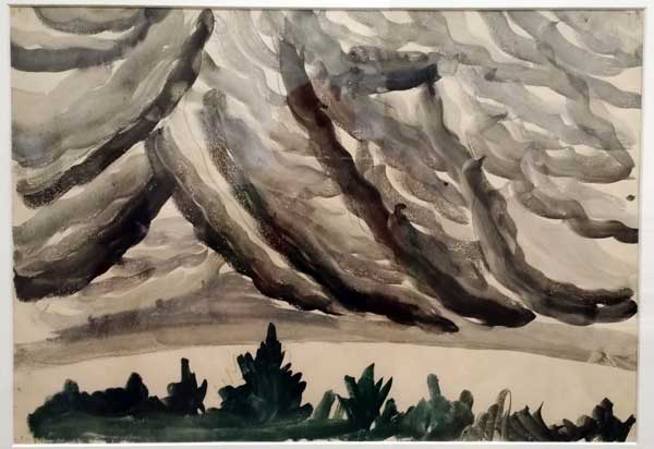
Many images in the Montclair show, which focuses specifically on weather depictions, date from this seminal 1916-1917 period. His strong graphic design sensibility shines through in fascinating watercolor and gouache works of forests, gardens, plants, flowers, brooks, clouds, mysterious ravines, and abandoned houses. From 1920 to 1929, while building his reputation as a fine artist, Burchfield supported his wife and five children as a wallpaper designer.
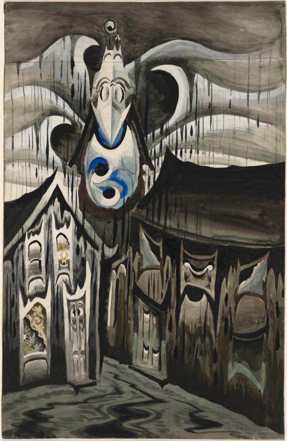
In his notebooks, he developed a visual language for human emotions and sounds (“Conventions for Abstract Thoughts”). Embedded throughout his paintings are symbolic representations of forces of nature (wind, rain, snow, sun and moon light) and sounds (humming insects, bird song, church bells, train whistles, even reverberations from telegraph wires). In images of houses and other buildings, an anthropomorphism, or empathic visualization, comes through which (to me) makes Burchfield a kindred spirit close to animation.
“Look on a tree not only as a design,” Burchfield wrote in a 1916 journal when he was 23, “but also as a living growing object, which almost has emotions like ourselves.” His sentient sentiment reminds me of 25-year-old Walt Disney saying of his animated cartoon in 1927, “I want the characters to be somebody. I don’t want them just to be a drawing.” Years later, Disney maintained, “The most important aim of any of the fine arts is to get a purely emotional response from the beholder.” In a 2011 The New Yorker profile, Pixar director Andrew Stanton describes perfectly an animator’s sensibility: “I can’t remember not thinking that my bike was cold in the rain, that fish are lonely in their bowl, that leaves are frightened of heights as they fall.”
As it turns out, Burchfield did have an interest in animated films and other movies in his essential awareness of “transience” in seasonal transitions, invisible vibes, and motion.
In 2009, I had the pleasure of personally finding that out when I flew to Buffalo to talk with Nancy Weekly, the world’s leading Burchfield authority, Curator and Head of Collections at the spacious Burchfield Penney Art Center. The Center, which had opened the year before, holds the largest collection of the works of Charles Burchfield, including a facsimile recreation of the artist’s studio.
“I believe Burchfield’s sense of animation predates his exposure to animated films,” Ms. Weekly said as we looked at examples of Burchfield’s art from every phase of his long career. “In 1915,” she continued, “after seeing Chinese scroll painting, he created ‘all-day sketches’ which chronicle visually changes in the weather and time of day—the position of the sun and moon. In a way, they are similar to storyboards. While he put the idea aside for a while, he revisited it later in life to create season transition paintings.”
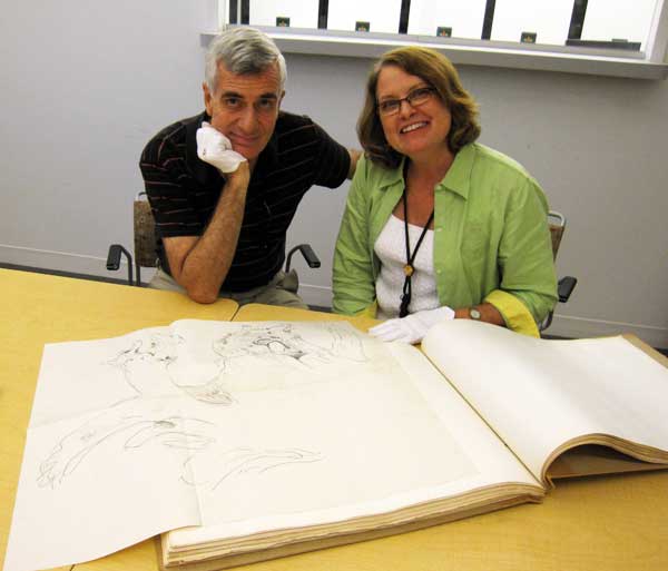
Ms. Weekly invited me into the museum’s archival section, restricted to scholars, where I was treated to a white-glove inspection of some of Burchfield’s hand-written journals and handmade albums and folders containing 25,000 preliminary drawings and studies.
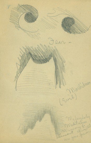
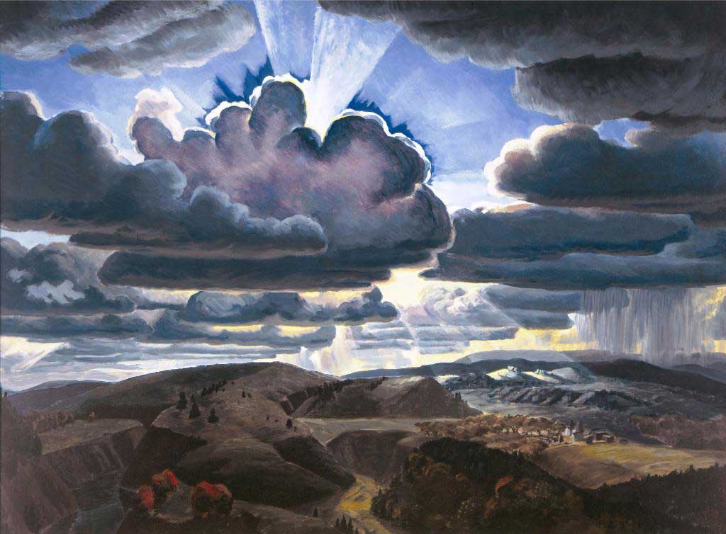
“Also related to animation,” she explained, “are his developments in 1917: ‘Conventions for Abstract Thoughts’ for human emotions and what I call audio-cryptograms, which are visual patterns for nature sounds, particularly insects, birds and frogs—and later phenomenon such as the wind/telegraph harp.” The visual “conventions” in many of Burchfield’s early and late period paintings convey psychological emotions when realism proved “inadequate for that goal.” For example, the ‘fear’ icons, in the upper portion of the sketch at left, can be seen at the center of Church Bells Ringing, shown above.
Burchfield’s journals confirm his keen interest in moving pictures and animation, and are peppered with his straight-forward film critiques. Benjamin J. Townsend, editor of Charles Burchfield Journals: The Poetry of Place, notes that Burchfield “did not hesitate to point out artistic flaws, even in those films he otherwise admired.” His tastes ran to Westerns, historical epics like The Ten Commandments and War and Peace, and, above all, the animated films of Walt Disney.
“He saw Snow White and the Seven Dwarfs at least three times and Bambi at least twice. Still, he objected to Disney’s distorted animation of animals and was outraged by the treatment of musical classics in Fantasia. Disney’s films came too late to have had a direct influence on Burchfield’s own use of ideographic conventions to animate nature, but there is no question that he found a reaffirmation of one aspect of his own art in Disney’s.”
After seeing Snow White for a second time on March 15, 1938, Burchfield wrote:
I enjoyed it more than the first time. Those flaws I noticed seemed to have lessened or disappeared. I had the thought while watching it that Walt Disney with his whimsical art will do more for the general peace & happiness of the world than all the propaganda and peace talk in the world; for to me it is inconceivable that a nation looking at such things could foster hate.
In an entry the next year (August 22, 1939) Burchfield commented that MGM’s The Wizard of Oz “was good, and delightful in spots, but it seemed to just fall short of greatness; nor could it be compared to Disney’s Snow White. The camera, when it comes to inventive fantasy, can never compete with the artist.”
As early as 1915, Burchfield drew on 19th-century aesthetics of synesthesia and symbolist theory (“… composing rhythms and colors” with designs “thrown upon a large screen to a large audience who could watch and receive the same sensations as on listening to notes”). Burchfield was “unconsciously parallel[ing] the association of abstract rhythm and color with musical tones and states of mind by Kandinsky, Robert Delaunay, and Morgan Russell,” Townsend observes. “More precisely, he anticipates Walt Disney’s use of the device in his animated films, especially Fantasia (1940).”
However, when he reluctantly did see Fantasia in 1941, his
. . . rage was so great that I was literally beside myself. There is no artistic need or justification for such a collaboration as this, in the first place—but even if we should agree it was worth trying—the cheap, low vulgarity of over half of the episodes, was simply incredible … The treatment of Beethoven’s 6th Symphony was pure destructive burlesque. Many writers have tried to excuse Disney on the grounds of ignorance — but it is more than that—it is a deliberate aim to besmirch and degrade everything that is fine & noble in our culture — It is like revolutionists throwing rocks thru cathedral windows.
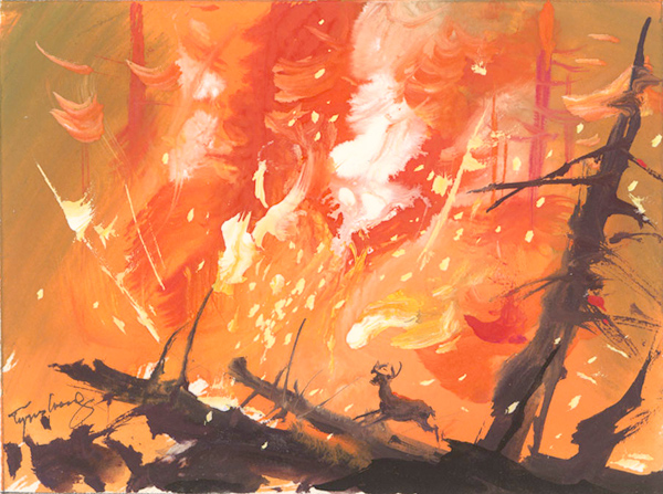
Although he viewed Bambi (1942) twice in 1948, he found it:
Somewhat of a disappointment — although the thunderstorm in the woods, the transition of autumn to winter, and the forest fire were still enchanting. Hard to take were the background music and the cloying sweetness of spring effects, and the “cuteness” of the animals with the enormous hard stylized eyes, and bulging foreheads. The humanizing of the animals was not a happy thought.
Burchfield preferred the stylized designs of the UPA cartoon studio. In 1954, after attending a Mr. Magoo Festival, four or five cartoons of the feisty comic character strung together, he wrote:
Equally fascinating as the comic situations arising out of his near-sightedness, are the highly decorative and conventionalized backgrounds and scenes. A golfing and hunting sequence had utterly fantastic trees & woods, yet somehow having the inner character of the woods much more than a more realistic or sentimental approach (such as Disney does to death).
 The backgrounds he complimented may have been in Grizzly Golfer, a 1951 Mr. Magoo short, above and below, directed by Pete Burness and designed by Abe Liss. (Thanks to Adam Abraham, author of When Magoo Flew, for suggesting the title.)
A final journal entry regarding Disney, in 1957, praises the time compressing fast-motion processes used in the True Life adventure documentary Secrets of Life (1956):
Of especial beauty for me, of course, was the incident of showing hepaticas pushing up out of dead leaves, and growing into full bloom. Apparently such plants are never [quiet], but move [too] slowly for us to see with the unaided eye. By speeding up the process, they were seen to sway back and forth as if in ecstasy. The speeded up picture of wild cucumber vines, made them apparent like serpents, swaying and writhing, looking for a place to fasten to.
Burchfield damned the accompanying (unnamed) cartoon as “incredibly bad,” concluding, “An amazing man, Disney, full of contradictions.” The shorts released by the Disney studio on Nov. 6, 1956 that accompanied Secrets of Life included a live-action short, Cowdog, and the cartoon was A Cowboy Needs a Horse.
In 2010, Nancy Weekly found a telegram sent to Walt Disney in regards to a 1965 exhibition beginning April 28 of “100 recent drawings by Charles Burchfield” from Dr. D. Kenneth Winebrenner, a professor of design at Buffalo State University, newspaper columnist, and later one of the founders of the Burchfield Center. Winebrenner wrote,
Burchfield, now 72 years old . . . modestly disclaims that his early work inspired your animations of nature in any way, but rumor persists. Exhibition program will feature about a doz. one of two paragraph statements, trib [sic] and greetings on his 50th anniversary as noted artist. If he inspired you in any way he would like to include a short message from you . . .
Ms. Weekly noted there was no response found in Dr. Winebrenner’s file, “so I don’t know if he ever received one.”

Walt Disney died on December 15, 1966. Charles Burchfield died on January 10, 1967.
If you’re interested in more context regarding the art of Charles Burchfield, here are three videos: one with Nancy Weekly from the Burchfield Penney Art Center; and two from The Whitney Museum of American Art on the 2010 exhibition, “Heat Waves in a Swamp – The Paintings of Charles Burchfield.”
Views: 4766